November 23, 2010
The “strategic default” or “walk away” is the final hurdle housing must get over. It only exists in certain areas and regions but it is potentially very dangerous. It can trigger self-sustaining price declines that carry forward and destroy building projects, investor profits and bank earnings. Builders, bankers and investors must all know how to quantify this risk.This article presents a conceptual approach to doing this.
The important point is that the price risk can be quantified. Loan originators and home builders can statistically locate and avoid areas facing walk away risk and severe price declines and investors can now locate and sidestep potentially dangerous investments.
The Walk Away
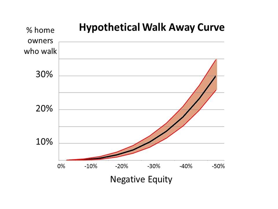
The strategic default or “walk away” is a new form of foreclosure. It occurs because of negative equity and is the only cause of foreclosure that is “price dependent.” By “price dependent” we mean that if home prices go down, greater negative equity is created, so "walk aways" and foreclosures increase. Likewise, if prices rise, negative equity declines and "walk aways" stop - or at least substantially slow down. The other two foreclosures - ARM rest or unemployment foreclosures – are not price dependent and occur simply from inability to pay the mortgage.
This “price dependency” adds a new wrinkle to how they are analyzed and the risks they pose. To see this I’m going to show the general process in five distinct steps:
Step 1 - The Walk Away Curve
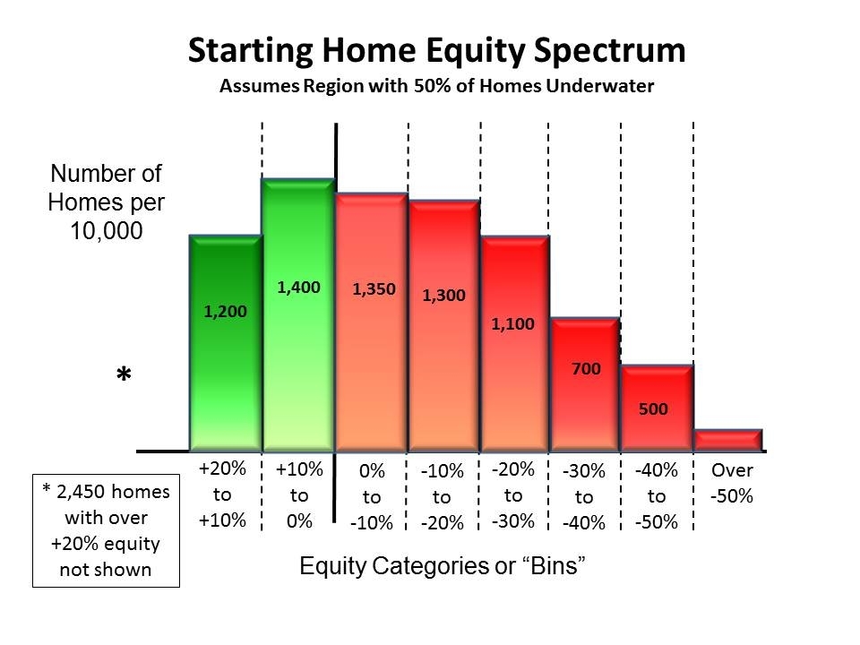
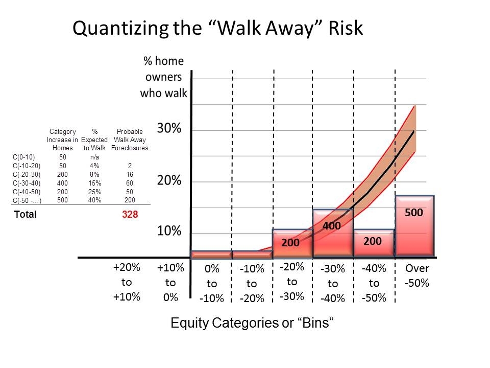
Step 2 – Obtain the Region's “Home Equity Spectrum”
The chart below shows a home equity spectrum for a region where 50% of the homes in the region are underwater. Homes are classified and put into “bins” or categories of equity. For example, the first red category shows that 1,350 homes have equity from zero to -10%. The second red category is equity from -10% to -20%, which covers 1,300 homes. The numbers shown in each category are the number of homes in that bin or category per 10,000 homes in the region.
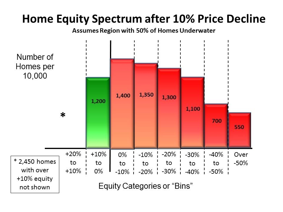
The region I follow just suffered a 10% price decline last quarter. Suppose the above equity spectrum was that region’s spectrum. After the 10% decline what does the new spectrum look like?
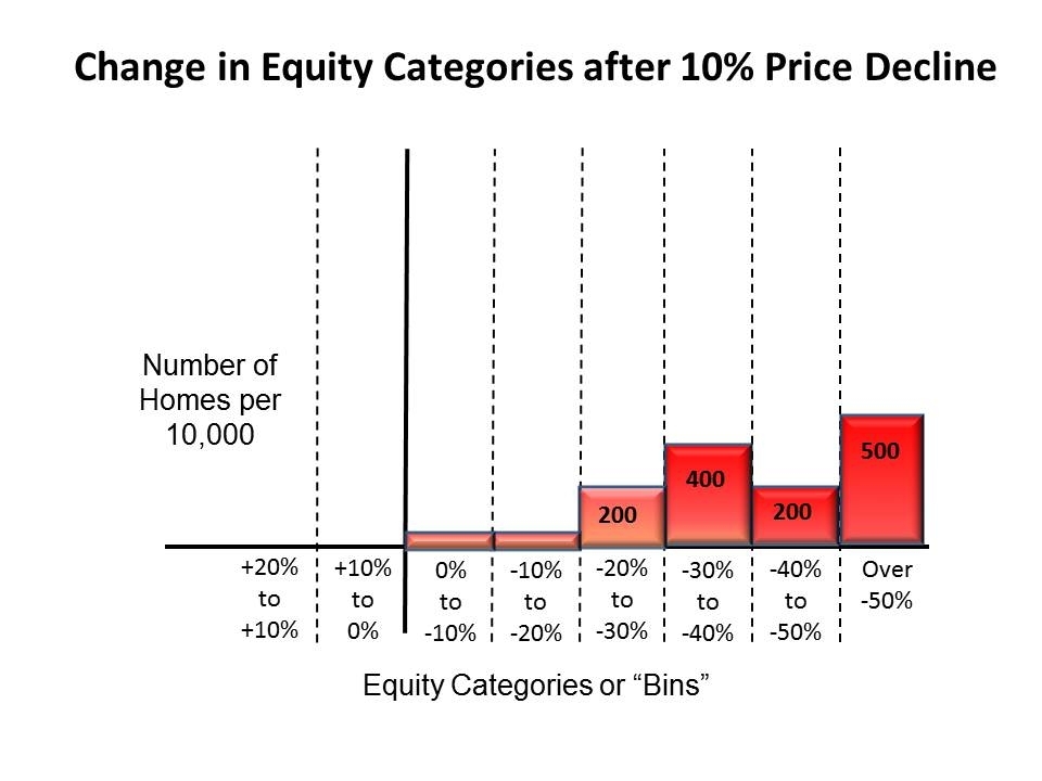
Step 4 – Quantizing the Risk
To assess or measure that risk we now superimpose on this chart the earlier walk away chart. Now we multiply the added number of homes in each category by the probability homeowners in that category will walk. For example, in our example we have 8% of homeowners in the -20% to -30% category will walk. That means, of the new 200 homes in that category, 16 will probably end up walking and in foreclosure. This calculation is done for each category and then they are all added. This sum indicates that 328 more homeowners per 10,000 will probably walk because of the 10% drop in home prices last quarter.
This risk doesn't exist in all areas, only in areas with high "months of sales," large shadow inventories and negative equity. There seems to be a tipping point of sustainability; when its passed the decline continues on its own. In other areas the price decline won't be self sustaining and it slowly stops on its own.
Closed Regions
Normally, declining home prices bring in buyers. If one area falls in price buyers in nearby areas migrate over and help normalize or equalize pricing in the two areas. However, in closed regions like Phoenix this is slow to happen. Buyers must migrate from outside the state. This difference is important.
In a reinforcing, walk away price decline, the number of potential buyers in the area actually declines. Buyers must have down payments. When prices decline more and more homeowners lose equity and their down payments. In the example above, when prices dropped 10%, 1400 per 10,000 homeowners lost down payments and are taken out of the buyer pool.
This gives added force to the decline. The price decline not only produces more foreclosures and homes coming to market, it also slowly wipes out the pool of potential homebuyers. This is an important consideration when analyzing the sustainability of a walk away price decline.
More Detail
In real life the analysis of the situation has to get into greater detail. But this essentially encapsulates the basic concept behind the walk away risk and how bankers, investors and builders can assess it. The important message is that the risk can be defined and measured within workable and measurable parameters.
No comments:
Post a Comment